Interactive Temperature Radar Map: Live Heat Map & How to Read
A temperature radar map delivers real-time weather heatmaps derived from advanced satellite data across 10,000+ global stations. Curious how sudden temperature drops affect your area? Explore dynamic heat gradients, track cold fronts instantly, and master reading thermal forecasts like a meteorologist. Diving in!
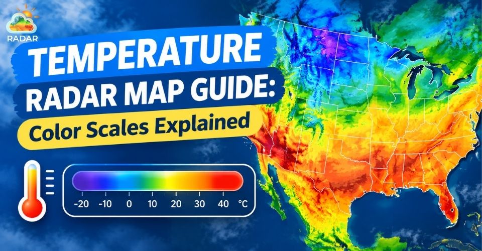
A temperature radar map delivers real-time weather
What is a Temperature Radar Map
A temperature radar map is an interactive visual weather map that displays real-time atmospheric temperatures and forecasts across different geographic regions using color-coded thermal heatmaps.
How Thermal Weather Maps Work
Thermal weather maps do not bounce radio waves off raindrops like Doppler radar does.
Instead, they gather data from thousands of ground weather stations, high-altitude weather balloons, and satellite infrared sensors.
Advanced meteorological computers process these observations continuously.
They blend real-time readings with numerical prediction models to render seamless heat gradients across cities, oceans, and continents.
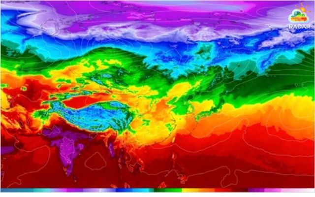
Thermal weather maps gather data from thousands of ground weather stations
Temperature Radar vs. Rain Radar: What’s the Difference?
It is common to confuse these two layers, but they serve completely different purposes:
-
Temperature Radar Map: Focuses strictly on surface air temperature, heatwaves, and cold fronts. It uses a continuous color gradient (from blue to dark red) to show thermal intensity.
-
Rain Radar (Precipitation Radar): Detects water droplets, snow, or hail in the atmosphere using active radar beams. It displays storm movement and rain intensity (light green to intense magenta).
While rain radar tells you if it will storm, a temperature radar map shows you how hot or cold it will feel when you step outside.
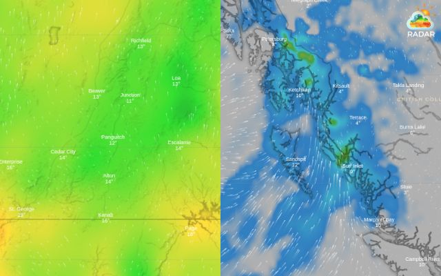
Temperature radar map and rain radar map
You may also like
Key elements of a Temperature Radar Map
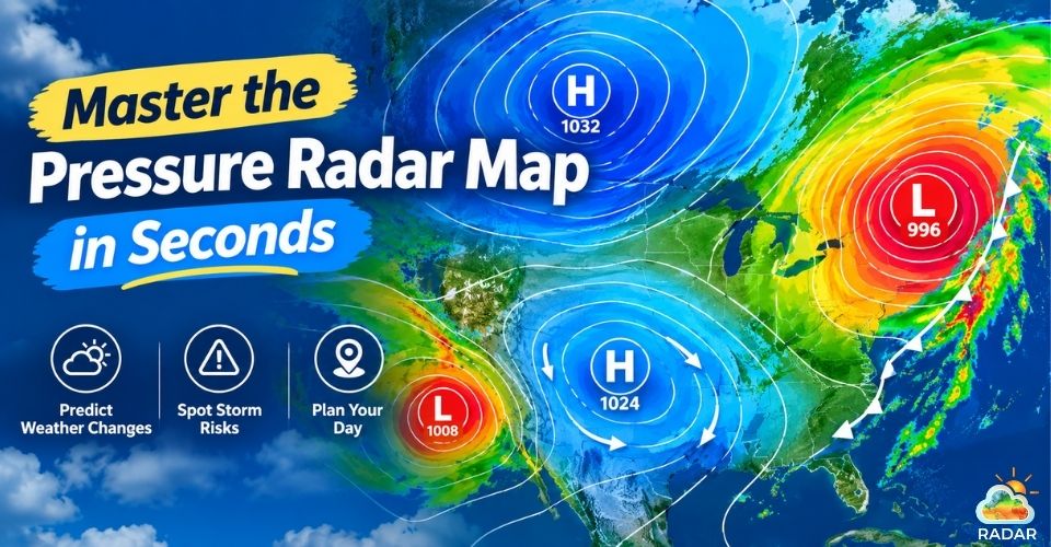
The key elements of a temperature radar map include dynamic color scales, localized numerical readings, isotherms, pressure markers (H and L), and wind overlay lines.
Dynamic Color Scale
The heat scale is the core feature of any thermal map. It assigns distinct color tones to specific temperature ranges:
-
Deep Purple & Blue: Sub-freezing temperatures and arctic frost (below 0°C / 32°F).
-
Green & Cyan: Cool to mild weather, typical for spring or autumn days.
-
Yellow & Orange: Warm, comfortable conditions.
-
Dark Red & Magenta: Extreme heatwaves and severe heat warnings (above 35°C / 95°F).
Temperature Numbers & Units
Static colors give a quick overview, but exact numbers offer precise clarity. Interactive maps display live temperature values at major cities or pinpointed GPS locations.
Most platforms allow seamless toggling between Fahrenheit (°F) and Celsius (°C) based on your preference.
Isotherms (Temperature Contour Lines)
Isotherms are smooth lines on a weather map connecting points of equal temperature.
When isotherms are packed tightly together, it signals a dramatic temperature shift over a short distance - often marking an active weather front.
Spaced-out isotherms mean steady, uniform temperatures across the region.
High (H) and Low (L) Pressure Markers
Air pressure directly controls temperature shifts:
-
Blue "H" (High Pressure): Brings clear skies, calm winds, and intense seasonal temperatures - scorching heat in summer or freezing cold in winter.
-
Red "L" (Low Pressure): Drives cloudy skies, rain, and rapid thermal changes as air masses mix.
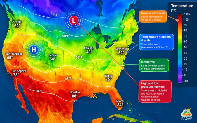
Key features of a temperature radar map
Why You Need A Real-Time Temperature Map
A real-time temperature map is essential because static forecasts only give daily averages, whereas live thermal heatmaps show exact temperature fluctuations, incoming weather fronts, and sudden microclimate changes as they happen.
-
Planning daily activities & outdoor events
A single daily high or low number rarely tells the whole story.
Real-time thermal maps reveal how temperatures shift hour by hour across specific neighborhoods or event venues.
Whether you are organizing a outdoor wedding, scheduling a morning run, or heading out for a day hike, checking a temperature map helps you dress properly and avoid uncomfortable thermal surprises.
-
Tracking extreme weather
Extreme temperature anomalies can develop rapidly:
-
Heatwaves: Heatmaps highlight dangerous heat domes expanding across inland areas, allowing you to prepare cooling measures in advance.
-
Polar Vortexes & Arctic Blast: Cold fronts show up as sharp blue gradients pushing south, signaling freezing temperatures and potential frost risks.
By tracking these air masses in real time, you can safeguard your home, pets, and family before severe conditions arrive.
-
Agriculture, Travel & Transport planning
Temperature directly impacts soil health, crop yields, and road safety:
-
Farmers & Gardeners: Monitor late-spring frosts or unseasonal heat spikes to protect sensitive crops.
-
Travelers & Logistics Managers: Check highway mountain passes for sudden drops below freezing that could create black ice or icy road hazards.
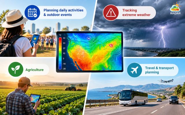
Benefits of a temperature radar map
Reading a Temperature Radar Map on GoWeatherRadar
Now let’s practice reading a temperature radar map on GoWeatherRadar - best weather radar website!
Step 1: Access the temperature layer
Open the map interface and locate the Layer Control Panel on the right side of your screen. Click on the Temperature option.
The map will instantly update from radar precipitation to a dynamic, color-coded temperature heatmap.
Step 2: Search your location or zoom globally
Type your target city, region, or zip code into the search bar at the top left corner.
Alternatively, click and drag across the map to pan globally, or use the zoom buttons (+ / -) to inspect neighborhood-level thermal details.
Step 3: Interpret color gradients and isotherms
Look at the Color Scale Bar anchored along the bottom edge of the map:
-
Blue to Purple: Sub-zero frost or freezing weather conditions.
-
Green to Yellow: Mild, pleasant outdoor temperatures.
-
Orange to Dark Red: Intense summer heat or extreme heatwave warnings.
Check the smooth contour lines (isotherms) to identify where temperature boundaries sit.
Tightly clustered lines indicate an active cold or warm front moving through the area.
Step 4: Use the Timeline Slider for 24-Hour & 7-Day Forecasts
Locate the Timeline Slider at the bottom of the map interface.
Click the Play button to watch how air masses move over the next few hours, or drag the slider manually to project thermal shifts across 24-hour and 7-day forecast windows.\
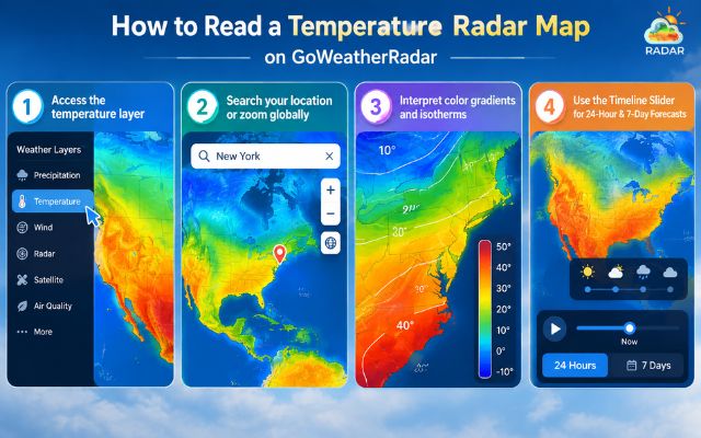
Steps to read a temperature radar map on GoWeatherRadar
Final Words
A live temperature radar map empowers you to track real-time thermal changes, heatwaves, and cold fronts with precision. By understanding color scales and isotherms, you can plan outdoor activities and travel safely. Explore GoWeatherRadar today to monitor live weather heatmaps and stay ahead of sudden atmospheric shifts!


0 Comments
Leave a Comment
Your email address will not be published. Required fields are marked *